Getting Around the New 3Rivers Website!
One of the most important components of any website is the navigation.
It’s how users get around and easily find what they are looking for. In a lot of ways, it’s like the blueprint to a large building. In that complex, different floors and rooms have their special purposes and there is a directory of help visitors find their way. A well-designed navigation scheme functions much the same way.
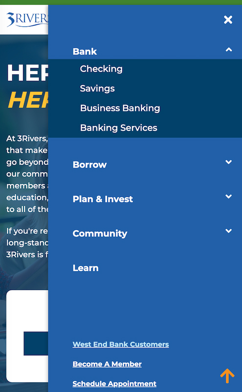
Our new site features a robust (but not overly complex) main navigation bar. All drop downs have quick links to their specific pages (even if that page appears within a page as a sub-navigation.)
Above the main navigation bar, we’ve chose to display the 3Rivers routing number (which is the most searched for content on our current site). We also make it easy for users to schedule appointments or chat (which pops up into a separate light box window when clicked).
DESKTOP VIEW

MOBILE VIEW


A click on the “Checking” selection from the BANK menu takes the visitor to the overall Checking page, featuring several of our products and services. In this example, clicking on the Standard option displays the content for a standard checking account immediately under the sub-navigation bar. If that selection isn't what you were looking for, you will be able to review all the products by selecting its name while staying on that page. It's that Easy!

No More Scrolling (and Scrolling) to Find Your Rate Info!
One of the biggest sources of friction on our current website is the display of rate information. This is despite many efforts to improve it. For this reason, it was one of the critical pre-requisites identified when we began planning the new website. We’re happy to share that we’ve overcome that challenge and have aligned our presentation of them to function much like the rest of the navigation on the new site.

When a user chooses to view rates info, they land on a page where all rates are categorized. And then, a sub-navigation allows them to quickly view the info they seek without unnecessary scrolling or page loading.


More Ways to Find What You're Searching for on the New Site!
The newly developed search capabilities with our new site are robust and built with the visitor experience in mind. As with most site search best practices, visitors can easily recognize the search bar in the top right corner of the homepage (and any page for that matter). Clicking it expands the bar for users to begin typing.

Once typing begins, there is an auto-fill feature to suggest top and common searches so the user doesn’t have to type it all if a match is found. We built a massive thesaurus into the backend to achieve this and will routinely update it as determined to be necessary based upon site search trending and happenings occur.
The search results will provide links to the content it finds, and will automatically filter to present the strongest/related search hits first (think “Google Page One”). Our Answers to Frequently Asked Questions will also mix in.

Finally, there is also be a filter available on the left side to enable visitors the ability to drilldown more precisely into what they are searching to find.

With this new smart search function, even your searched-for word(s) isn’t/aren’t in the content title, it will find it in the body of all copy and then BOLD appropriate words/phrases.

The Financial Education Center Experience
The Financial Education Section (can you tell we’re excited?), let’s talk about the contents we haven’t already covered in previous messages.
First, there is a SubNavigation bar displaying all the selections/tools designed to help with any source of education. The categories are BLOG, FINANCIAL EDUCATION, FAQ, CALCULATORS, TOOLS, TECH, and more may come in the future.

The Blog and Financial Education is an evolution of the great wellness content already in use. Some enhancements include the option to search via category, contributor, and tags. Clicking “Learn More” opens the selected post. Then, once on the post page, (as is the case with most pages in the Financial Education Center) a right-side tool bar enables users to quickly POST, PRINT, and EMAIL the content.


The Tools option displays quick selections for various tools that can be utilized for financial wellness, like SWITCHkit, SavvyMoney, Credit Sense, and LoanSaver. At the top of the page, just under the sub-navigation, you will see "Quick Links" that will shoot you directly to that tool.

Blog Content is easily sharable on Social Media FAST & EASY!
Buttons on our current and future website allow users to easily share blog content on social platforms like Facebook, Twitter, and more. It’s a great way to help get the content and tools in front a massive audience, which boosts our reach and domain authority. It’s free marketing with enormous returns.

Looking for fresh and clean features? We have you covered!
Clean Landing Pages
Clean landing pages with more visuals helps to keep the visitor engaged and not overwhelmed with content. These landing pages are established to help introduce the product or department and help to keep us ADA Compliant on mobile devises.


MEET THE TEAM PAGES
Throughout our resource centers, we have many individuals who are commonly out and about in our community to network, form relationships, and serve our membership. To help them establish familiarity with the folks they meet and interact with we profile the Team3 representatives serving that area where appropriate.
On pages that display the pics, names and titles of the Team Members serving those areas, clicking on the Team Member displays their bio and important, relevant links, such as Sharefile links. Another click collapses that profile for you to continue navigating the site.


You've Got Questions, our Website has Answers (to FAQs)!
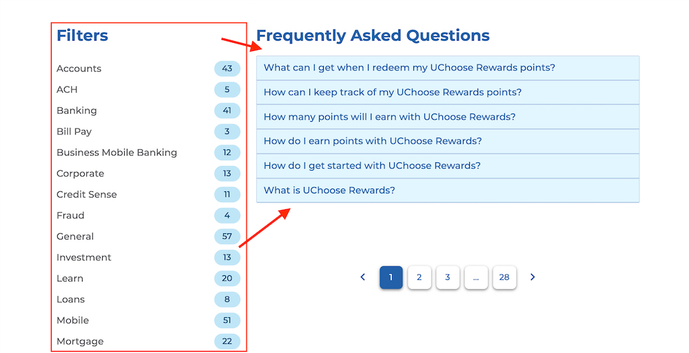
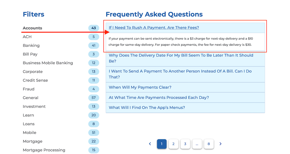
One of the key sections of the Financial Education Center is the Frequently Asked Questions (FAQ). This robust section will include answers to FAQs that are filterable. Simply click on the filter label will give you a selection of FAQs related to it. From there, just click on the question. An accordion menu then displays the answer. Another click closes it to allow for another selection.

